Primary Button

ESSENTIAL
레이블
OPTIONAL
아이콘
Buttons
Primary Button은 제출, 확인, 구매, 등록 등 주요 행동 유도, 결정할 때 사용합니다.

Buttons
Primary Button은 제출, 확인, 구매, 등록 등 주요 행동 유도, 결정할 때 사용합니다.
Buttons
Primary Button은 제출, 확인, 구매, 등록 등 주요 행동 유도, 결정할 때 사용합니다.
ESSENTIAL
OPTIONAL
ESSENTIAL
OPTIONAL
ESSENTIAL
OPTIONAL

Control
state
default
hover
disabled
Left Icon
Right Icon
Control
state
default
hover
disabled
Left Icon
Right Icon
Control
state
default
hover
disabled
Left Icon
Right Icon
Content
Content
Content
Content
Content

Toolip은 기준 요소를 중심으로 주변 관계에 따라 적절한 위치를 선택해서 사용합니다.
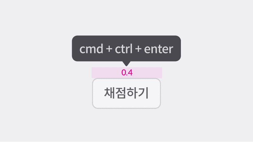
요소와 Tooltip 사이의 간격은 0.4rem로 통일하여 사용합니다.

ESSENTIAL
ㅏㅜㅏㅓㅏㅏ
OPTIONAL
ESSENTIAL
ㅏㅜㅏㅓㅏㅏ
OPTIONAL
ESSENTIAL
ㅏㅜㅏㅓㅏㅏ
OPTIONAL

Control
state
default
hover
disabled
Left Icon
Right Icon
Control
state
default
hover
disabled
Left Icon
Right Icon
Control
state
default
hover
disabled
Left Icon
Right Icon
position | top-start, top , top-end, left,right, bottom-start, bottom, bottom-end |
color | gray, purple |
icon | false, true |
text | string |
position | top-start, top , top-end, left,right, bottom-start, bottom, bottom-end |
color | gray, purple |
icon | false, true |
text | string |
position | top-start, top , top-end, left,right, bottom-start, bottom, bottom-end |
color | gray, purple |
icon | false, true |
text | string |
Tooltip 텍스트는 두 줄 이상으로 확장하여 사용할 수 있습니다.

Tooltip 안에 버튼, 링크와 같은 인터랙션 요소를 포함할 수 없습니다.
Tooltip 텍스트는 두 줄 이상으로 확장하여 사용할 수 있습니다.
Tooltip 안에 버튼, 링크와 같은 인터랙션 요소를 포함할 수 없습니다.
Tooltip 텍스트는 두 줄 이상으로 확장하여 사용할 수 있습니다.
Tooltip 안에 버튼, 링크와 같은 인터랙션 요소를 포함할 수 없습니다.

ESSENTIAL
OPTIONAL
ESSENTIAL
OPTIONAL
ESSENTIAL
OPTIONAL

Control
state
default
hover
disabled
Left Icon
Right Icon
Control
state
default
hover
disabled
Left Icon
Right Icon
Control
state
default
hover
disabled
Left Icon
Right Icon
position | top-start, top , top-end, left,right, bottom-start, bottom, bottom-end |
color | gray, purple |
icon | false, true |
text | string |
position | top-start, top , top-end, left,right, bottom-start, bottom, bottom-end |
color | gray, purple |
icon | false, true |
text | string |
position | top-start, top , top-end, left,right, bottom-start, bottom, bottom-end |
color | gray, purple |
icon | false, true |
text | string |

ESSENTIAL
OPTIONAL
ESSENTIAL
OPTIONAL
ESSENTIAL
OPTIONAL

Control
state
default
hover
disabled
Left Icon
Right Icon
Control
state
default
hover
disabled
Left Icon
Right Icon
Control
state
default
hover
disabled
Left Icon
Right Icon
position | top-start, top , top-end, left,right, bottom-start, bottom, bottom-end |
color | gray, purple |
icon | false, true |
text | string |
position | top-start, top , top-end, left,right, bottom-start, bottom, bottom-end |
color | gray, purple |
icon | false, true |
text | string |
position | top-start, top , top-end, left,right, bottom-start, bottom, bottom-end |
color | gray, purple |
icon | false, true |
text | string |

ESSENTIAL
OPTIONAL
ESSENTIAL
OPTIONAL
ESSENTIAL
OPTIONAL

Control
state
default
hover
disabled
Control
state
default
hover
disabled
Control
state
default
hover
disabled
position | top-start, top , top-end, left,right, bottom-start, bottom, bottom-end |
color | gray, purple |
icon | false, true |
text | string |
position | top-start, top , top-end, left,right, bottom-start, bottom, bottom-end |
color | gray, purple |
icon | false, true |
text | string |
position | top-start, top , top-end, left,right, bottom-start, bottom, bottom-end |
color | gray, purple |
icon | false, true |
text | string |
©Codeit
Contact Us
©Codeit
Contact Us
©Codeit
Contact Us