Primary Button

ESSENTIAL
레이블
OPTIONAL
아이콘
Buttons
Primary Button은 제출, 확인, 구매, 등록 등 주요 행동 유도, 결정할 때 사용합니다.

Buttons
Primary Button은 제출, 확인, 구매, 등록 등 주요 행동 유도, 결정할 때 사용합니다.
Buttons
Primary Button은 제출, 확인, 구매, 등록 등 주요 행동 유도, 결정할 때 사용합니다.
ESSENTIAL
OPTIONAL
ESSENTIAL
OPTIONAL
ESSENTIAL
OPTIONAL

Control
state
default
hover
disabled
Left Icon
Right Icon
Control
state
default
hover
disabled
Left Icon
Right Icon
Control
state
default
hover
disabled
Left Icon
Right Icon
Content
Content
Content
Content
Content

Top: 9.4(PC) / 6.8(TB-MO)

Bottom: 2.4(PC) / 1.6(TB-MO)
Right 3.2(PC) / 2.4(TB-MO)

ESSENTIAL
ㅏㅜㅏㅓㅏㅏ
OPTIONAL
ESSENTIAL
ㅏㅜㅏㅓㅏㅏ
OPTIONAL
ESSENTIAL
ㅏㅜㅏㅓㅏㅏ
OPTIONAL

Control
state
default
hover
disabled
Left Icon
Right Icon
Control
state
default
hover
disabled
Left Icon
Right Icon
Control
state
default
hover
disabled
Left Icon
Right Icon
breakpoint | PC, MO |
right box | false, true |
description | false, true |
breakpoint | PC, MO |
right box | false, true |
description | false, true |
breakpoint | PC, MO |
right box | false, true |
description | false, true |
문장은 짧고 간결하게 작성하고 마침표는 사용하지
않습니다.
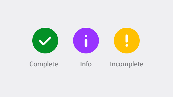
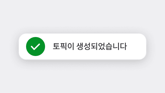
3가지 역할안에서 맞는 타입을 사용합니다.
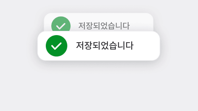
동일한 액션에 대해 Toast를 중복 노출하지 않습니다.
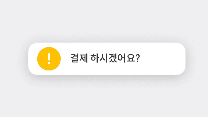
중요한 결정을 Toast로 전달하지 않습니다.(ex. 결제 하시겠어요?)
문장은 짧고 간결하게 작성하고 마침표는 사용하지
않습니다.
3가지 역할안에서 맞는 타입을 사용합니다.
동일한 액션에 대해 Toast를 중복 노출하지 않습니다.
중요한 결정을 Toast로 전달하지 않습니다.(ex. 결제 하시겠어요?)
문장은 짧고 간결하게 작성하고 마침표는 사용하지
않습니다.
3가지 역할안에서 맞는 타입을 사용합니다.
동일한 액션에 대해 Toast를 중복 노출하지 않습니다.
중요한 결정을 Toast로 전달하지 않습니다.(ex. 결제 하시겠어요?)

ESSENTIAL
OPTIONAL
ESSENTIAL
OPTIONAL
ESSENTIAL
OPTIONAL

Control
state
default
hover
disabled
Left Icon
Right Icon
Control
state
default
hover
disabled
Left Icon
Right Icon
Control
state
default
hover
disabled
Left Icon
Right Icon
breakpoint | PC, MO |
right box | false, true |
description | false, true |
breakpoint | PC, MO |
right box | false, true |
description | false, true |
breakpoint | PC, MO |
right box | false, true |
description | false, true |

ESSENTIAL
OPTIONAL
ESSENTIAL
OPTIONAL
ESSENTIAL
OPTIONAL

Control
state
default
hover
disabled
Left Icon
Right Icon
Control
state
default
hover
disabled
Left Icon
Right Icon
Control
state
default
hover
disabled
Left Icon
Right Icon
breakpoint | PC, MO |
right box | false, true |
description | false, true |
breakpoint | PC, MO |
right box | false, true |
description | false, true |
breakpoint | PC, MO |
right box | false, true |
description | false, true |

ESSENTIAL
OPTIONAL
ESSENTIAL
OPTIONAL
ESSENTIAL
OPTIONAL

Control
state
default
hover
disabled
Control
state
default
hover
disabled
Control
state
default
hover
disabled
breakpoint | PC, MO |
right box | false, true |
description | false, true |
breakpoint | PC, MO |
right box | false, true |
description | false, true |
breakpoint | PC, MO |
right box | false, true |
description | false, true |
©Codeit
Contact Us
©Codeit
Contact Us
©Codeit
Contact Us