Primary Button

ESSENTIAL
레이블
OPTIONAL
아이콘
Buttons
Primary Button은 제출, 확인, 구매, 등록 등 주요 행동 유도, 결정할 때 사용합니다.

Buttons
Primary Button은 제출, 확인, 구매, 등록 등 주요 행동 유도, 결정할 때 사용합니다.
Buttons
Primary Button은 제출, 확인, 구매, 등록 등 주요 행동 유도, 결정할 때 사용합니다.
ESSENTIAL
OPTIONAL
ESSENTIAL
OPTIONAL
ESSENTIAL
OPTIONAL

Control
state
default
hover
disabled
Left Icon
Right Icon
Control
state
default
hover
disabled
Left Icon
Right Icon
Control
state
default
hover
disabled
Left Icon
Right Icon
Content
Content
Content
Content
Content
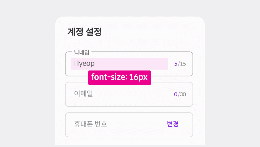
모바일에서 자동 화면 확대가 발생하지 않게 PC와 동일한 사이즈를 사용합니다.

ESSENTIAL
ㅏㅜㅏㅓㅏㅏ
OPTIONAL
ESSENTIAL
ㅏㅜㅏㅓㅏㅏ
OPTIONAL
ESSENTIAL
ㅏㅜㅏㅓㅏㅏ
OPTIONAL

Control
state
default
hover
disabled
Left Icon
Right Icon
Control
state
default
hover
disabled
Left Icon
Right Icon
Control
state
default
hover
disabled
Left Icon
Right Icon
variant | default, auto filled, error, positive |
state | default, hover, disabled |
focused | false, true |
has value | false, true |
label | false, true |
text button | false, true |
icon button | false, true |
word limit | false, true |
helper text | false, true |
background | false, true |
label | false, true |
text | false, true |
여러 인풋을 입력할 때는 레이블 텍스트 사용을 권장합니다.

에러 상태에는 헬퍼 텍스트로 명확한 피드백을 제공해야 합니다.(색약/색맹 사용자를 고려)
여러 인풋을 입력할 때는 레이블 텍스트 사용을 권장합니다.
에러 상태에는 헬퍼 텍스트로 명확한 피드백을 제공해야 합니다.(색약/색맹 사용자를 고려)
여러 인풋을 입력할 때는 레이블 텍스트 사용을 권장합니다.
에러 상태에는 헬퍼 텍스트로 명확한 피드백을 제공해야 합니다.(색약/색맹 사용자를 고려)

ESSENTIAL
OPTIONAL
ESSENTIAL
OPTIONAL
ESSENTIAL
OPTIONAL

Control
state
default
hover
disabled
Left Icon
Right Icon
Control
state
default
hover
disabled
Left Icon
Right Icon
Control
state
default
hover
disabled
Left Icon
Right Icon
variant | default, auto filled, error, positive |
state | default, hover, disabled |
focused | false, true |
has value | false, true |
label | false, true |
text button | false, true |
icon button | false, true |
word limit | false, true |
helper text | false, true |
background | false, true |
label | false, true |
text | false, true |

ESSENTIAL
OPTIONAL
ESSENTIAL
OPTIONAL
ESSENTIAL
OPTIONAL

Control
state
default
hover
disabled
Left Icon
Right Icon
Control
state
default
hover
disabled
Left Icon
Right Icon
Control
state
default
hover
disabled
Left Icon
Right Icon
variant | default, auto filled, error, positive |
state | default, hover, disabled |
focused | false, true |
has value | false, true |
label | false, true |
text button | false, true |
icon button | false, true |
word limit | false, true |
helper text | false, true |
background | false, true |
label | false, true |
text | false, true |

ESSENTIAL
OPTIONAL
ESSENTIAL
OPTIONAL
ESSENTIAL
OPTIONAL

Control
state
default
hover
disabled
Control
state
default
hover
disabled
Control
state
default
hover
disabled
variant | default, auto filled, error, positive |
state | default, hover, disabled |
focused | false, true |
has value | false, true |
label | false, true |
text button | false, true |
icon button | false, true |
word limit | false, true |
helper text | false, true |
background | false, true |
label | false, true |
text | false, true |
©Codeit
Contact Us
©Codeit
Contact Us
©Codeit
Contact Us