Primary Button

ESSENTIAL
레이블
OPTIONAL
아이콘
Buttons
Primary Button은 제출, 확인, 구매, 등록 등 주요 행동 유도, 결정할 때 사용합니다.

Buttons
Primary Button은 제출, 확인, 구매, 등록 등 주요 행동 유도, 결정할 때 사용합니다.
Buttons
Primary Button은 제출, 확인, 구매, 등록 등 주요 행동 유도, 결정할 때 사용합니다.
ESSENTIAL
OPTIONAL
ESSENTIAL
OPTIONAL
ESSENTIAL
OPTIONAL

Control
state
default
hover
disabled
Left Icon
Right Icon
Control
state
default
hover
disabled
Left Icon
Right Icon
Control
state
default
hover
disabled
Left Icon
Right Icon
Content
Content
Content
Content
Content
레이블 텍스트는 옵션이며 숨길 수 있습니다.
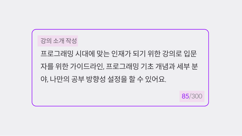
최대 글자 수 설정값을 변경할 수 있으며 숨길 수 있습니다.

Min-height는 2줄 이상 작성할 수 있는 정도로 설정해 주세요.

ESSENTIAL
ㅏㅜㅏㅓㅏㅏ
OPTIONAL
ESSENTIAL
ㅏㅜㅏㅓㅏㅏ
OPTIONAL
ESSENTIAL
ㅏㅜㅏㅓㅏㅏ
OPTIONAL

Control
state
default
hover
disabled
Left Icon
Right Icon
Control
state
default
hover
disabled
Left Icon
Right Icon
Control
state
default
hover
disabled
Left Icon
Right Icon
size | L, S |
state | disabled, default |
variant | read only, default |
has value | false, true |
focused | false, true |
label | false, true |
word limit | false, true |
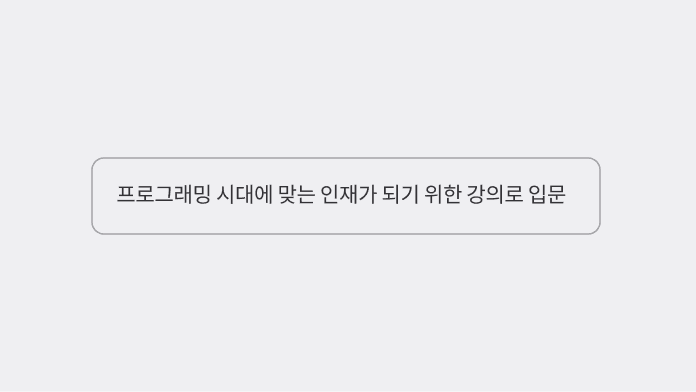
placeholder | string |
size | L, S |
state | disabled, default |
variant | read only, default |
has value | false, true |
focused | false, true |
label | false, true |
word limit | false, true |
placeholder | string |
size | L, S |
state | disabled, default |
variant | read only, default |
has value | false, true |
focused | false, true |
label | false, true |
word limit | false, true |
placeholder | string |
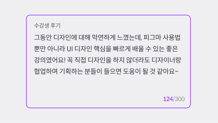
충분한 내용을 입력받아야 할 경우, 높이를 넉넉하게 설정해 주세요.
Textfield와 오해하지 않도록 최소 3줄 이상의 높이를 설정해야 합니다.
충분한 내용을 입력받아야 할 경우, 높이를 넉넉하게 설정해 주세요.
Textfield와 오해하지 않도록 최소 3줄 이상의 높이를 설정해야 합니다.
충분한 내용을 입력받아야 할 경우, 높이를 넉넉하게 설정해 주세요.
Textfield와 오해하지 않도록 최소 3줄 이상의 높이를 설정해야 합니다.

ESSENTIAL
OPTIONAL
ESSENTIAL
OPTIONAL
ESSENTIAL
OPTIONAL

Control
state
default
hover
disabled
Left Icon
Right Icon
Control
state
default
hover
disabled
Left Icon
Right Icon
Control
state
default
hover
disabled
Left Icon
Right Icon
size | L, S |
state | disabled, default |
variant | read only, default |
has value | false, true |
focused | false, true |
label | false, true |
word limit | false, true |
placeholder | string |
size | L, S |
state | disabled, default |
variant | read only, default |
has value | false, true |
focused | false, true |
label | false, true |
word limit | false, true |
placeholder | string |
size | L, S |
state | disabled, default |
variant | read only, default |
has value | false, true |
focused | false, true |
label | false, true |
word limit | false, true |
placeholder | string |

ESSENTIAL
OPTIONAL
ESSENTIAL
OPTIONAL
ESSENTIAL
OPTIONAL

Control
state
default
hover
disabled
Left Icon
Right Icon
Control
state
default
hover
disabled
Left Icon
Right Icon
Control
state
default
hover
disabled
Left Icon
Right Icon
size | L, S |
state | disabled, default |
variant | read only, default |
has value | false, true |
focused | false, true |
label | false, true |
word limit | false, true |
placeholder | string |
size | L, S |
state | disabled, default |
variant | read only, default |
has value | false, true |
focused | false, true |
label | false, true |
word limit | false, true |
placeholder | string |
size | L, S |
state | disabled, default |
variant | read only, default |
has value | false, true |
focused | false, true |
label | false, true |
word limit | false, true |
placeholder | string |

ESSENTIAL
OPTIONAL
ESSENTIAL
OPTIONAL
ESSENTIAL
OPTIONAL

Control
state
default
hover
disabled
Control
state
default
hover
disabled
Control
state
default
hover
disabled
size | L, S |
state | disabled, default |
variant | read only, default |
has value | false, true |
focused | false, true |
label | false, true |
word limit | false, true |
placeholder | string |
size | L, S |
state | disabled, default |
variant | read only, default |
has value | false, true |
focused | false, true |
label | false, true |
word limit | false, true |
placeholder | string |
size | L, S |
state | disabled, default |
variant | read only, default |
has value | false, true |
focused | false, true |
label | false, true |
word limit | false, true |
placeholder | string |
©Codeit
Contact Us
©Codeit
Contact Us
©Codeit
Contact Us