Primary Button

ESSENTIAL
레이블
OPTIONAL
아이콘
Buttons
Primary Button은 제출, 확인, 구매, 등록 등 주요 행동 유도, 결정할 때 사용합니다.

Buttons
Primary Button은 제출, 확인, 구매, 등록 등 주요 행동 유도, 결정할 때 사용합니다.
Buttons
Primary Button은 제출, 확인, 구매, 등록 등 주요 행동 유도, 결정할 때 사용합니다.
ESSENTIAL
OPTIONAL
ESSENTIAL
OPTIONAL
ESSENTIAL
OPTIONAL

Control
state
default
hover
disabled
Left Icon
Right Icon
Control
state
default
hover
disabled
Left Icon
Right Icon
Control
state
default
hover
disabled
Left Icon
Right Icon
Content
Content
Content
Content
Content
각 아이템의 우측에 여백을 포함하고 조합 간격은 0px로 설정합니다.

ESSENTIAL
ㅏㅜㅏㅓㅏㅏ
OPTIONAL
ESSENTIAL
ㅏㅜㅏㅓㅏㅏ
OPTIONAL
ESSENTIAL
ㅏㅜㅏㅓㅏㅏ
OPTIONAL

Control
state
default
hover
disabled
Left Icon
Right Icon
Control
state
default
hover
disabled
Left Icon
Right Icon
Control
state
default
hover
disabled
Left Icon
Right Icon
size | L,M,S |
color | gray,purple |
state | default,hover |
selected | false, true |
count | false, true |
left icon | false, true |
right icon | false, true |
right spacing | false, true |
border | false, true |
tab name | string |
size | L,M,S |
color | gray,purple |
state | default,hover |
selected | false, true |
count | false, true |
left icon | false, true |
right icon | false, true |
right spacing | false, true |
border | false, true |
tab name | string |
size | L,M,S |
color | gray,purple |
state | default,hover |
selected | false, true |
count | false, true |
left icon | false, true |
right icon | false, true |
right spacing | false, true |
border | false, true |
tab name | string |

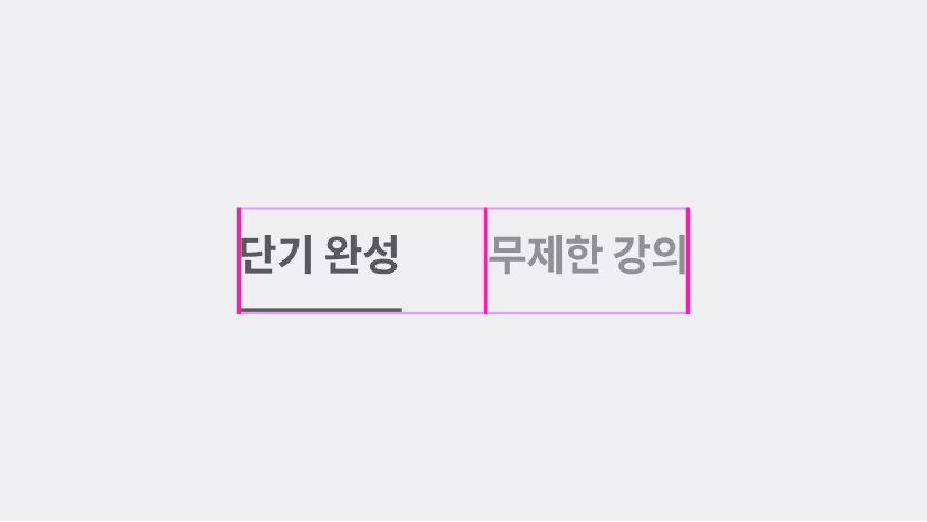
기본 Tab Menu는 선택된(selected) 상태로 페이지가 렌더링되어 있어야 합니다.

2줄로 줄바꿈되는 탭 아이템을 만들지 않습니다.
기본 Tab Menu는 선택된(selected) 상태로 페이지가 렌더링되어 있어야 합니다.
2줄로 줄바꿈되는 탭 아이템을 만들지 않습니다.
기본 Tab Menu는 선택된(selected) 상태로 페이지가 렌더링되어 있어야 합니다.
2줄로 줄바꿈되는 탭 아이템을 만들지 않습니다.

ESSENTIAL
OPTIONAL
ESSENTIAL
OPTIONAL
ESSENTIAL
OPTIONAL

Control
state
default
hover
disabled
Left Icon
Right Icon
Control
state
default
hover
disabled
Left Icon
Right Icon
Control
state
default
hover
disabled
Left Icon
Right Icon
size | L,M,S |
color | gray,purple |
state | default,hover |
selected | false, true |
count | false, true |
left icon | false, true |
right icon | false, true |
right spacing | false, true |
border | false, true |
tab name | string |
size | L,M,S |
color | gray,purple |
state | default,hover |
selected | false, true |
count | false, true |
left icon | false, true |
right icon | false, true |
right spacing | false, true |
border | false, true |
tab name | string |
size | L,M,S |
color | gray,purple |
state | default,hover |
selected | false, true |
count | false, true |
left icon | false, true |
right icon | false, true |
right spacing | false, true |
border | false, true |
tab name | string |

ESSENTIAL
OPTIONAL
ESSENTIAL
OPTIONAL
ESSENTIAL
OPTIONAL

Control
state
default
hover
disabled
Left Icon
Right Icon
Control
state
default
hover
disabled
Left Icon
Right Icon
Control
state
default
hover
disabled
Left Icon
Right Icon
size | L,M,S |
color | gray,purple |
state | default,hover |
selected | false, true |
count | false, true |
left icon | false, true |
right icon | false, true |
right spacing | false, true |
border | false, true |
tab name | string |
size | L,M,S |
color | gray,purple |
state | default,hover |
selected | false, true |
count | false, true |
left icon | false, true |
right icon | false, true |
right spacing | false, true |
border | false, true |
tab name | string |
size | L,M,S |
color | gray,purple |
state | default,hover |
selected | false, true |
count | false, true |
left icon | false, true |
right icon | false, true |
right spacing | false, true |
border | false, true |
tab name | string |

ESSENTIAL
OPTIONAL
ESSENTIAL
OPTIONAL
ESSENTIAL
OPTIONAL

Control
state
default
hover
disabled
Control
state
default
hover
disabled
Control
state
default
hover
disabled
size | L,M,S |
color | gray,purple |
state | default,hover |
selected | false, true |
count | false, true |
left icon | false, true |
right icon | false, true |
right spacing | false, true |
border | false, true |
tab name | string |
size | L,M,S |
color | gray,purple |
state | default,hover |
selected | false, true |
count | false, true |
left icon | false, true |
right icon | false, true |
right spacing | false, true |
border | false, true |
tab name | string |
size | L,M,S |
color | gray,purple |
state | default,hover |
selected | false, true |
count | false, true |
left icon | false, true |
right icon | false, true |
right spacing | false, true |
border | false, true |
tab name | string |
©Codeit
Contact Us
©Codeit
Contact Us
©Codeit
Contact Us