Primary Button

ESSENTIAL
레이블
OPTIONAL
아이콘
Buttons
Primary Button은 제출, 확인, 구매, 등록 등 주요 행동 유도, 결정할 때 사용합니다.

Buttons
Primary Button은 제출, 확인, 구매, 등록 등 주요 행동 유도, 결정할 때 사용합니다.
Buttons
Primary Button은 제출, 확인, 구매, 등록 등 주요 행동 유도, 결정할 때 사용합니다.
ESSENTIAL
OPTIONAL
ESSENTIAL
OPTIONAL
ESSENTIAL
OPTIONAL

Control
state
default
hover
disabled
Left Icon
Right Icon
Control
state
default
hover
disabled
Left Icon
Right Icon
Control
state
default
hover
disabled
Left Icon
Right Icon
Content
Content
Content
Content
Content

Dropdown list와 함께 사용하고, z-index는 가장 우선으로 설정합니다.
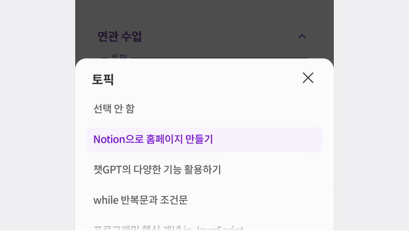
모바일에서는 Bottom Sheet 형태로 사용합니다.

ESSENTIAL
ㅏㅜㅏㅓㅏㅏ
OPTIONAL
ESSENTIAL
ㅏㅜㅏㅓㅏㅏ
OPTIONAL
ESSENTIAL
ㅏㅜㅏㅓㅏㅏ
OPTIONAL

Control
state
default
hover
disabled
Left Icon
Right Icon
Control
state
default
hover
disabled
Left Icon
Right Icon
Control
state
default
hover
disabled
Left Icon
Right Icon
size | L, S |
state | default, disabled, hover |
variant | default, error |
has value | false, true |
focused | false, true |
label | false, true |
dropdown | false, true |
background | false, true |
helper text | false, true |
label text | string |
size | L, S |
state | default, disabled, hover |
variant | default, error |
has value | false, true |
focused | false, true |
label | false, true |
dropdown | false, true |
background | false, true |
helper text | false, true |
label text | string |
size | L, S |
state | default, disabled, hover |
variant | default, error |
has value | false, true |
focused | false, true |
label | false, true |
dropdown | false, true |
background | false, true |
helper text | false, true |
label text | string |
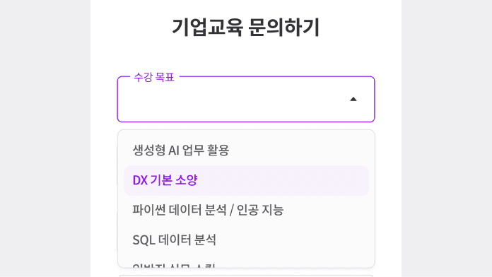
선택지는 짧고 간결하게 작성해야 합니다.
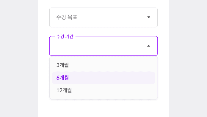
선택지가 4개 미만인 경우 Select를 사용하지 않습니다.
선택지는 짧고 간결하게 작성해야 합니다.
선택지가 4개 미만인 경우 Select를 사용하지 않습니다.
선택지는 짧고 간결하게 작성해야 합니다.
선택지가 4개 미만인 경우 Select를 사용하지 않습니다.

ESSENTIAL
OPTIONAL
ESSENTIAL
OPTIONAL
ESSENTIAL
OPTIONAL

Control
state
default
hover
disabled
Left Icon
Right Icon
Control
state
default
hover
disabled
Left Icon
Right Icon
Control
state
default
hover
disabled
Left Icon
Right Icon
size | L, S |
state | default, disabled, hover |
variant | default, error |
has value | false, true |
focused | false, true |
label | false, true |
dropdown | false, true |
background | false, true |
helper text | false, true |
label text | string |
size | L, S |
state | default, disabled, hover |
variant | default, error |
has value | false, true |
focused | false, true |
label | false, true |
dropdown | false, true |
background | false, true |
helper text | false, true |
label text | string |
size | L, S |
state | default, disabled, hover |
variant | default, error |
has value | false, true |
focused | false, true |
label | false, true |
dropdown | false, true |
background | false, true |
helper text | false, true |
label text | string |

ESSENTIAL
OPTIONAL
ESSENTIAL
OPTIONAL
ESSENTIAL
OPTIONAL

Control
state
default
hover
disabled
Left Icon
Right Icon
Control
state
default
hover
disabled
Left Icon
Right Icon
Control
state
default
hover
disabled
Left Icon
Right Icon
size | L, S |
state | default, disabled, hover |
variant | default, error |
has value | false, true |
focused | false, true |
label | false, true |
dropdown | false, true |
background | false, true |
helper text | false, true |
label text | string |
size | L, S |
state | default, disabled, hover |
variant | default, error |
has value | false, true |
focused | false, true |
label | false, true |
dropdown | false, true |
background | false, true |
helper text | false, true |
label text | string |
size | L, S |
state | default, disabled, hover |
variant | default, error |
has value | false, true |
focused | false, true |
label | false, true |
dropdown | false, true |
background | false, true |
helper text | false, true |
label text | string |

ESSENTIAL
OPTIONAL
ESSENTIAL
OPTIONAL
ESSENTIAL
OPTIONAL

Control
state
default
hover
disabled
Control
state
default
hover
disabled
Control
state
default
hover
disabled
size | L, S |
state | default, disabled, hover |
variant | default, error |
has value | false, true |
focused | false, true |
label | false, true |
dropdown | false, true |
background | false, true |
helper text | false, true |
label text | string |
size | L, S |
state | default, disabled, hover |
variant | default, error |
has value | false, true |
focused | false, true |
label | false, true |
dropdown | false, true |
background | false, true |
helper text | false, true |
label text | string |
size | L, S |
state | default, disabled, hover |
variant | default, error |
has value | false, true |
focused | false, true |
label | false, true |
dropdown | false, true |
background | false, true |
helper text | false, true |
label text | string |
©Codeit
Contact Us
©Codeit
Contact Us
©Codeit
Contact Us