Primary Button

ESSENTIAL
레이블
OPTIONAL
아이콘
Buttons
Primary Button은 제출, 확인, 구매, 등록 등 주요 행동 유도, 결정할 때 사용합니다.
Buttons
Primary Button은 제출, 확인, 구매, 등록 등 주요 행동 유도, 결정할 때 사용합니다.
Buttons
Primary Button은 제출, 확인, 구매, 등록 등 주요 행동 유도, 결정할 때 사용합니다.
ESSENTIAL
OPTIONAL
ESSENTIAL
OPTIONAL
ESSENTIAL
OPTIONAL

Control
state
default
hover
disabled
Left Icon
Right Icon
Control
state
default
hover
disabled
Left Icon
Right Icon
Control
state
default
hover
disabled
Left Icon
Right Icon
Content
Content
Content
Content
Content

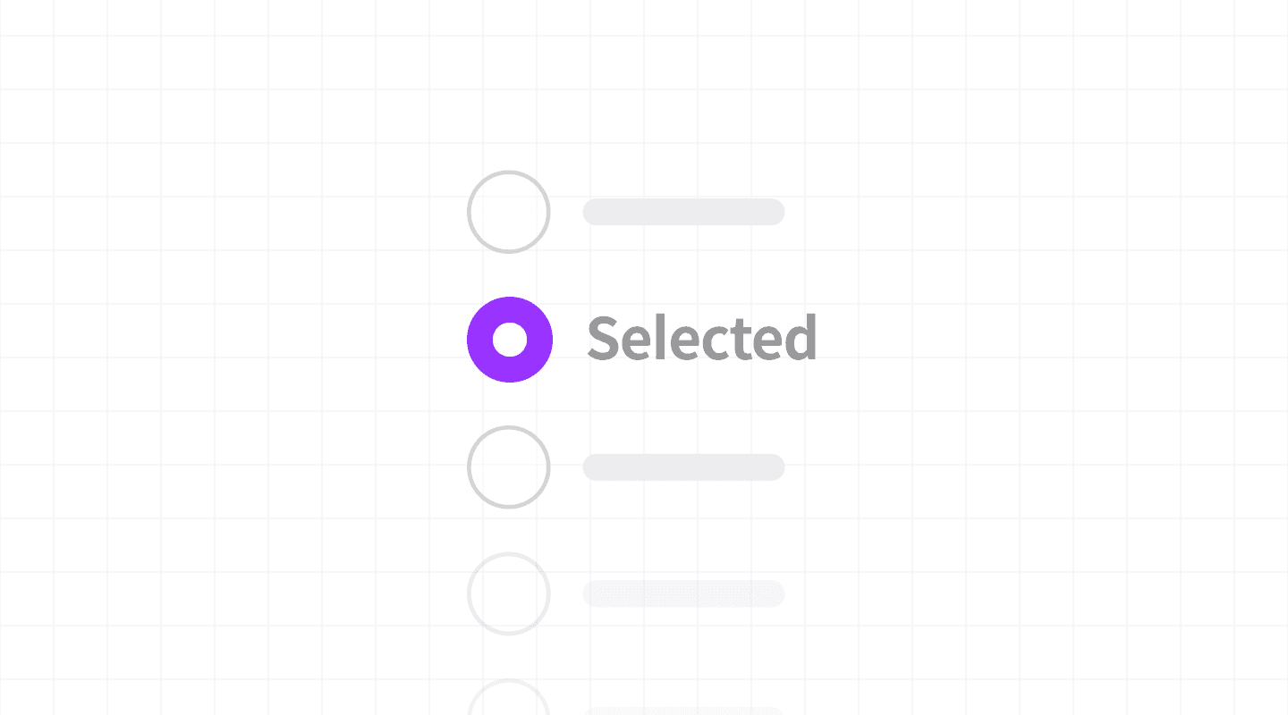
레이블까지 클릭할 수 있게 합니다.
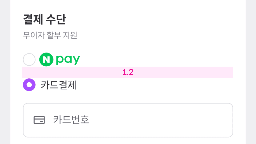
리스트에 사용할 때는 최소 1.2rem이상 간격을 가져야 합니다.

ESSENTIAL
ㅏㅜㅏㅓㅏㅏ
OPTIONAL
ESSENTIAL
ㅏㅜㅏㅓㅏㅏ
OPTIONAL
ESSENTIAL
ㅏㅜㅏㅓㅏㅏ
OPTIONAL

Control
state
default
hover
disabled
Left Icon
Right Icon
Control
state
default
hover
disabled
Left Icon
Right Icon
Control
state
default
hover
disabled
Left Icon
Right Icon
size | L, S |
state | dafault, hover, disabled |
selected | false, true |
has label | false, true |
description | false, true |
size | L, S |
state | dafault, hover, disabled |
selected | false, true |
has label | false, true |
description | false, true |
size | L, S |
state | dafault, hover, disabled |
selected | false, true |
has label | false, true |
description | false, true |

한 번에 하나의 옵션만 선택 가능하도록 설정합니다. 필수 선택이 필요한 경우 기본 선택값을 제공합니다.
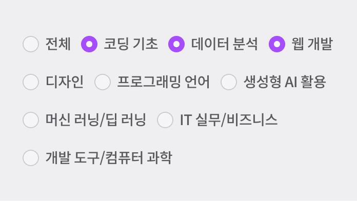
옵션이 5개 이상일 경우 드롭다운 메뉴를 사용해야 합니다.
한 번에 하나의 옵션만 선택 가능하도록 설정합니다. 필수 선택이 필요한 경우 기본 선택값을 제공합니다.
옵션이 5개 이상일 경우 드롭다운 메뉴를 사용해야 합니다.
한 번에 하나의 옵션만 선택 가능하도록 설정합니다. 필수 선택이 필요한 경우 기본 선택값을 제공합니다.
옵션이 5개 이상일 경우 드롭다운 메뉴를 사용해야 합니다.

ESSENTIAL
OPTIONAL
ESSENTIAL
OPTIONAL
ESSENTIAL
OPTIONAL

Control
state
default
hover
disabled
Left Icon
Right Icon
Control
state
default
hover
disabled
Left Icon
Right Icon
Control
state
default
hover
disabled
Left Icon
Right Icon
size | L, S |
state | dafault, hover, disabled |
selected | false, true |
has label | false, true |
description | false, true |
size | L, S |
state | dafault, hover, disabled |
selected | false, true |
has label | false, true |
description | false, true |
size | L, S |
state | dafault, hover, disabled |
selected | false, true |
has label | false, true |
description | false, true |

ESSENTIAL
OPTIONAL
ESSENTIAL
OPTIONAL
ESSENTIAL
OPTIONAL

Control
state
default
hover
disabled
Left Icon
Right Icon
Control
state
default
hover
disabled
Left Icon
Right Icon
Control
state
default
hover
disabled
Left Icon
Right Icon
size | L, S |
state | dafault, hover, disabled |
selected | false, true |
has label | false, true |
description | false, true |
size | L, S |
state | dafault, hover, disabled |
selected | false, true |
has label | false, true |
description | false, true |
size | L, S |
state | dafault, hover, disabled |
selected | false, true |
has label | false, true |
description | false, true |

ESSENTIAL
OPTIONAL
ESSENTIAL
OPTIONAL
ESSENTIAL
OPTIONAL

Control
state
default
hover
disabled
Control
state
default
hover
disabled
Control
state
default
hover
disabled
size | L, S |
state | dafault, hover, disabled |
selected | false, true |
has label | false, true |
description | false, true |
size | L, S |
state | dafault, hover, disabled |
selected | false, true |
has label | false, true |
description | false, true |
size | L, S |
state | dafault, hover, disabled |
selected | false, true |
has label | false, true |
description | false, true |
©Codeit
Contact Us
©Codeit
Contact Us
©Codeit
Contact Us