Primary Button

ESSENTIAL
레이블
OPTIONAL
아이콘
Buttons
Primary Button은 제출, 확인, 구매, 등록 등 주요 행동 유도, 결정할 때 사용합니다.

Buttons
Primary Button은 제출, 확인, 구매, 등록 등 주요 행동 유도, 결정할 때 사용합니다.
Buttons
Primary Button은 제출, 확인, 구매, 등록 등 주요 행동 유도, 결정할 때 사용합니다.
ESSENTIAL
OPTIONAL
ESSENTIAL
OPTIONAL
ESSENTIAL
OPTIONAL

Control
state
default
hover
disabled
Left Icon
Right Icon
Control
state
default
hover
disabled
Left Icon
Right Icon
Control
state
default
hover
disabled
Left Icon
Right Icon
Content
Content
Content
Content
Content
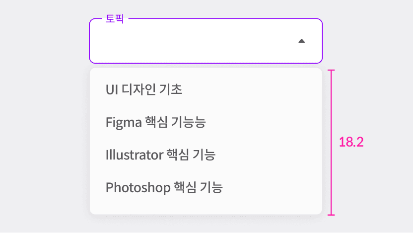
최대 높이(max-height)는 18.2rem로 제한됩니다.
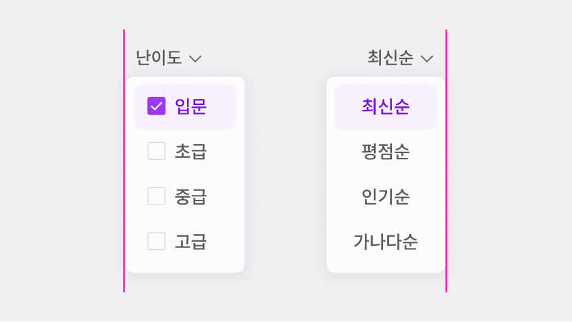
상대적 위치에 따라 정렬을 선택할 수 있습니다. (ex. 오른쪽에 위치하면 오른쪽 정렬)
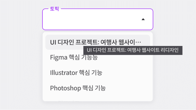
PC 환경에서는 긴 텍스트를 말줄임 처리 후 툴팁으로 제공하고, 모바일 환경에서는 긴 텍스트를 루프(loop) 형태로 처리합니다.

ESSENTIAL
ㅏㅜㅏㅓㅏㅏ
OPTIONAL
ESSENTIAL
ㅏㅜㅏㅓㅏㅏ
OPTIONAL
ESSENTIAL
ㅏㅜㅏㅓㅏㅏ
OPTIONAL

Control
state
default
hover
disabled
Left Icon
Right Icon
Control
state
default
hover
disabled
Left Icon
Right Icon
Control
state
default
hover
disabled
Left Icon
Right Icon
state | default, hover |
variant | default, selected |
size | L,S |
align | left,right |
search | false, true |
checkbox | false, true |
description | false, true |
text | string |
state | default, hover |
variant | default, selected |
size | L,S |
align | left,right |
search | false, true |
checkbox | false, true |
description | false, true |
text | string |
state | default, hover |
variant | default, selected |
size | L,S |
align | left,right |
search | false, true |
checkbox | false, true |
description | false, true |
text | string |

5개 이상의 항목이 존재할 경우 스크롤을 제공하여 접근성을 높입니다.

선택지가 많은 경우 검색 옵션을 활성화 합니다.
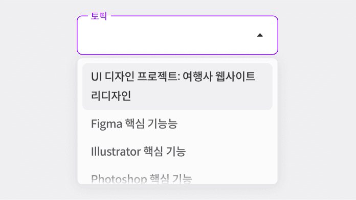
레이블이 두 줄로 넘어가지 않도록 설정합니다.
5개 이상의 항목이 존재할 경우 스크롤을 제공하여 접근성을 높입니다.
선택지가 많은 경우 검색 옵션을 활성화 합니다.
레이블이 두 줄로 넘어가지 않도록 설정합니다.
5개 이상의 항목이 존재할 경우 스크롤을 제공하여 접근성을 높입니다.
선택지가 많은 경우 검색 옵션을 활성화 합니다.
레이블이 두 줄로 넘어가지 않도록 설정합니다.

ESSENTIAL
OPTIONAL
ESSENTIAL
OPTIONAL
ESSENTIAL
OPTIONAL

Control
state
default
hover
disabled
Left Icon
Right Icon
Control
state
default
hover
disabled
Left Icon
Right Icon
Control
state
default
hover
disabled
Left Icon
Right Icon
state | default, hover |
variant | default, selected |
size | L,S |
align | left,right |
search | false, true |
checkbox | false, true |
description | false, true |
text | string |
state | default, hover |
variant | default, selected |
size | L,S |
align | left,right |
search | false, true |
checkbox | false, true |
description | false, true |
text | string |
state | default, hover |
variant | default, selected |
size | L,S |
align | left,right |
search | false, true |
checkbox | false, true |
description | false, true |
text | string |

ESSENTIAL
OPTIONAL
ESSENTIAL
OPTIONAL
ESSENTIAL
OPTIONAL

Control
state
default
hover
disabled
Left Icon
Right Icon
Control
state
default
hover
disabled
Left Icon
Right Icon
Control
state
default
hover
disabled
Left Icon
Right Icon
state | default, hover |
variant | default, selected |
size | L,S |
align | left,right |
search | false, true |
checkbox | false, true |
description | false, true |
text | string |
state | default, hover |
variant | default, selected |
size | L,S |
align | left,right |
search | false, true |
checkbox | false, true |
description | false, true |
text | string |
state | default, hover |
variant | default, selected |
size | L,S |
align | left,right |
search | false, true |
checkbox | false, true |
description | false, true |
text | string |

ESSENTIAL
OPTIONAL
ESSENTIAL
OPTIONAL
ESSENTIAL
OPTIONAL

Control
state
default
hover
disabled
Control
state
default
hover
disabled
Control
state
default
hover
disabled
state | default, hover |
variant | default, selected |
size | L,S |
align | left,right |
search | false, true |
checkbox | false, true |
description | false, true |
text | string |
state | default, hover |
variant | default, selected |
size | L,S |
align | left,right |
search | false, true |
checkbox | false, true |
description | false, true |
text | string |
state | default, hover |
variant | default, selected |
size | L,S |
align | left,right |
search | false, true |
checkbox | false, true |
description | false, true |
text | string |
©Codeit
Contact Us
©Codeit
Contact Us
©Codeit
Contact Us