Primary Button

ESSENTIAL
레이블
버튼의 주요 행동을 명확하게 설명하는 텍스트입니다. 항상 레이블이 포함되어야 하며, 아이콘만 단독으로 사용하는 것은 허용하지 않습니다.
OPTIONAL
아이콘
버튼의 의미를 시각적으로 보조하기 위해 사용합니다. 레이블만으로 의미가 충분히 전달되는 경우 아이콘은 생략합니다.
Buttons
Button은 가장 주요한 UI 컴포넌트입니다. 정해진 스타일 가이드에 따라 사용하며, 시스템 일관성을 위해 임의 변경은 권장하지 않습니다. 여러 버튼이 함께 사용되는 경우, 방향키 또는 Tab 키로 포커스 이동을 지원합니다.

Buttons
Button은 가장 주요한 UI 컴포넌트입니다. 정해진 스타일 가이드에 따라 사용하며, 시스템 일관성을 위해 임의 변경은 권장하지 않습니다. 여러 버튼이 함께 사용되는 경우, 방향키 또는 Tab 키로 포커스 이동을 지원합니다.
ESSENTIAL
버튼의 주요 행동을 명확하게 설명하는 텍스트입니다. 항상 레이블이 포함되어야 하며, 아이콘만 단독으로 사용하는 것은 허용하지 않습니다.
OPTIONAL
버튼의 의미를 시각적으로 보조하기 위해 사용합니다. 레이블만으로 의미가 충분히 전달되는 경우 아이콘은 생략합니다.
ESSENTIAL
버튼의 주요 행동을 명확하게 설명하는 텍스트입니다. 항상 레이블이 포함되어야 하며, 아이콘만 단독으로 사용하는 것은 허용하지 않습니다.
OPTIONAL
버튼의 의미를 시각적으로 보조하기 위해 사용합니다. 레이블만으로 의미가 충분히 전달되는 경우 아이콘은 생략합니다.
Size | L, M, S | |||||
State | default, hover, disabled | |||||
Icon-left | false, true | |||||
Icon-right | false, true | |||||
Size | L, M, S | |||||
State | default, hover, disabled | |||||
Icon-left | false, true | |||||
Icon-right | false, true | |||||

버튼 사이즈별 최소 Padding 값은 순서대로 24px, 16px, 12px입니다.

레이블 길이에 따라 버튼 너비를 유동적으로 사용할 수 있습니다.

Full Width는 모바일 환경에서만 사용하는 것을 권장합니다.
버튼 사이즈별 최소 Padding 값은 순서대로 24px, 16px, 12px입니다.
레이블 길이에 따라 버튼 너비를 유동적으로 사용할 수 있습니다.
Full Width는 모바일 환경에서만 사용하는 것을 권장합니다.
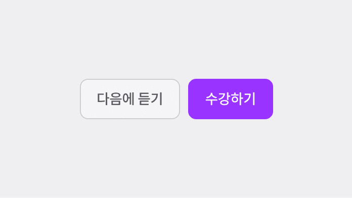
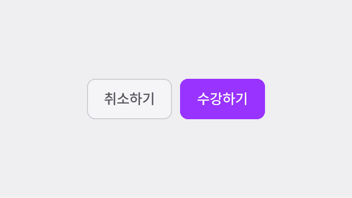
Primary Button은 가장 우측에 배치합니다.
Primary Button을 여러 개 나열하지 않습니다.
Primary Button은 가장 우측에 배치합니다.
Primary Button을 여러 개 나열하지 않습니다.

ESSENTIAL
Primary Button보다 낮은 우선순위의 액션을 설명하는 텍스트입니다. 주요 흐름을 방해하지 않도록 간결하게 작성합니다.
OPTIONAL
행동의 의미를 보조하기 위해 선택적으로 사용합니다. 다른 버튼과 함께 배치되는 경우, 버튼 간 시각적 위계를 고려해 아이콘 사용 여부를 결정합니다.
ESSENTIAL
Primary Button보다 낮은 우선순위의 액션을 설명하는 텍스트입니다. 주요 흐름을 방해하지 않도록 간결하게 작성합니다.
OPTIONAL
행동의 의미를 보조하기 위해 선택적으로 사용합니다. 다른 버튼과 함께 배치되는 경우, 버튼 간 시각적 위계를 고려해 아이콘 사용 여부를 결정합니다.
Size | L, M, S | |||||
State | default, hover, disabled | |||||
Icon-left | false, true | |||||
Icon-right | false, true | |||||
Size | L, M, S | |||||
State | default, hover, disabled | |||||
Icon-left | false, true | |||||
Icon-right | false, true | |||||

버튼 사이즈별 최소 Padding 값은 순서대로 24px, 16px, 12px입니다.

레이블 길이에 따라 버튼 너비를 유동적으로 사용할 수 있습니다.

Full Width는 모바일 환경에서만 사용하는 것을 권장합니다.
버튼 사이즈별 최소 Padding 값은 순서대로 24px, 16px, 12px입니다.
레이블 길이에 따라 버튼 너비를 유동적으로 사용할 수 있습니다.
Full Width는 모바일 환경에서만 사용하는 것을 권장합니다.
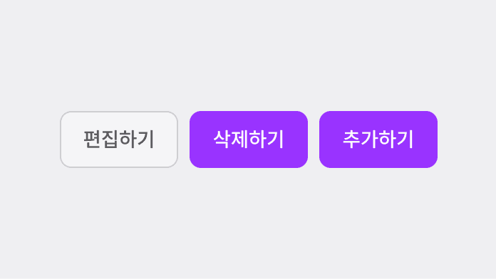
주로 설정 UI에서 여러 개 버튼을 나열해서 사용합니다.
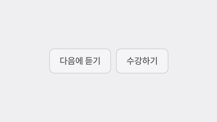
가장 강조해야 할 버튼에 사용하지 않습니다.
주로 설정 UI에서 여러 개 버튼을 나열해서 사용합니다.
가장 강조해야 할 버튼에 사용하지 않습니다.

ESSENTIAL
화면 내에서 사용자가 선택할 수 있는 추가 행동을 명확하게 전달하는 텍스트입니다.
OPTIONAL
행동의 의미를 보완하기 위해 선택적으로 사용합니다. 주요 액션보다 시각적으로 과도하게 강조되지 않도록, 아이콘 사용은 맥락에 따라 신중하게 결정합니다.
ESSENTIAL
화면 내에서 사용자가 선택할 수 있는 추가 행동을 명확하게 전달하는 텍스트입니다.
OPTIONAL
행동의 의미를 보완하기 위해 선택적으로 사용합니다. 주요 액션보다 시각적으로 과도하게 강조되지 않도록, 아이콘 사용은 맥락에 따라 신중하게 결정합니다.
Size | L, M, S |
State | default, hover, disabled |
Color | gray, purple |
Icon-left | false, true |
Icon-right | false, true |
Size | L, M, S |
State | default, hover, disabled |
Color | gray, purple |
Icon-left | false, true |
Icon-right | false, true |

버튼 사이즈별 최소 Padding 값은 순서대로 24px, 16px, 12px입니다.
버튼 사이즈별 최소 Padding 값은 순서대로 24px, 16px, 12px입니다.
주요 행동을 유도하지만 Primary Button과 함께 사용되어야 하는 경우, Tertiary Button(purple)을 사용합니다.
Full width로 사용할 수 없습니다.
주요 행동을 유도하지만 Primary Button과 함께 사용되어야 하는 경우, Tertiary Button(purple)을 사용합니다.
Full width로 사용할 수 없습니다.

ESSENTIAL
텍스트만으로 구성된 버튼의 행동을 전달하는 요소입니다. 시각적 강조보다 맥락 속 보조 행동이나 추가 선택지로 인식되도록 간결하게 작성합니다.
OPTIONAL
텍스트만으로 의미 전달이 어려운 경우, 행동의 방향이나 흐름을 보완하기 위해 사용합니다. 텍스트의 가독성을 해치지 않도록 신중하게 사용합니다.
ESSENTIAL
텍스트만으로 구성된 버튼의 행동을 전달하는 요소입니다. 시각적 강조보다 맥락 속 보조 행동이나 추가 선택지로 인식되도록 간결하게 작성합니다.
OPTIONAL
텍스트만으로 의미 전달이 어려운 경우, 행동의 방향이나 흐름을 보완하기 위해 사용합니다. 텍스트의 가독성을 해치지 않도록 신중하게 사용합니다.
Size | L, M, S |
State | default, hover, disabled |
Color | gray, purple |
Icon-left | false, true |
Icon-right | false, true |
Size | L, M, S |
State | default, hover, disabled |
Color | gray, purple |
Icon-left | false, true |
Icon-right | false, true |

아이콘은 좌측 또는 우측에 배치할 수 있습니다.
Chevron 아이콘 외 기본적으로 좌측 배치를 권장합니다.
아이콘은 좌측 또는 우측에 배치할 수 있습니다.
Chevron 아이콘 외 기본적으로 좌측 배치를 권장합니다.
네 글자를 권장하고 상황에 따라 ‘~하기’로 Writing 규칙을 준수해야 합니다.
네 글자를 권장하고 상황에 따라 ‘~하기’로 Writing 규칙을 준수해야 합니다.

ESSENTIAL
텍스트 없이 아이콘만으로 행동의 의미가 명확히 전달되는 경우에만 사용합니다. 누구나 즉시 이해할 수 있는 유니버설한 의미를 가진 아이콘을 사용합니다.
ESSENTIAL
텍스트 없이 아이콘만으로 행동의 의미가 명확히 전달되는 경우에만 사용합니다. 누구나 즉시 이해할 수 있는 유니버설한 의미를 가진 아이콘을 사용합니다.
Size | L, M, S |
State | default, hover, disabled |
Color | default, invert |
Size | L, M, S |
State | default, hover, disabled |
Color | default, invert |

Hover 영역을 고려해 전체 크기를 설정합니다.
L (padding 8px), M (padding 6px),
S (padding 4px)

모바일 환경에서 버튼 간 간격은 최소 12px 이상을 권장합니다.
Hover 영역을 고려해 전체 크기를 설정합니다.
L (padding 8px), M (padding 6px),
S (padding 4px)
모바일 환경에서 버튼 간 간격은 최소 12px 이상을 권장합니다.
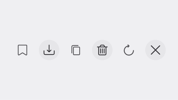
다운로드, 복사, 삭제, 초기화, 북마크 저장 등 행동이 명확한 경우 Icon Button을 사용할 수 있습니다.
다운로드, 복사, 삭제, 초기화, 북마크 저장 등 행동이 명확한 경우 Icon Button을 사용할 수 있습니다.
Accordion
Buttons
Buttons